The Infinitive Language Tutors
The Infinitive Language Tutors is a Victoria-based tutoring business specialising in French and English language education for secondary school students. They offer personalised online learning through one-on-one sessions, as well as interactive workshops and informative masterclasses, all of which are aligned with the VCE curriculum. This ensures students receive thorough preparation and approach their exams with confidence.
Background
I was approached by the founder to design a brand identity that reflects their core values of trust, professionalism and empathy, along with a suite of cohesive and practical collateral and templates to streamline workflow and support brand consistency within the business.
Deliverables
Logo (Primary, Secondary and Submark)
Brand Style Guide
PowerPoint/Google Slides Presentation Templates
Email Signatures
Pull-Up Banner
Letterheads
Definition of 'Infinitive’
The name ‘Infinitive’ refers to the root form of a verb, which connects to mastering basic skills before further development. It also relates to unlocking ‘infinite’ potential and opportunity which reflects on the brand’s commitment to growth and learning. Both meanings align closely with the brand’s services and values, making the name both memorable and significant, and supporting strong brand recognition and recall.
Trio Target Audience
A unique challenge of this project was designing for a trio audience; the service is being provided directly to the student, the decision of the parent, and potential recommendation of the teacher. It was important that the brand appeal was balanced across all three audiences.
To achieve this, a visual identity was created, following these objectives:
Emphasise the academic and emotional care that’s given to students through encouragement and a joy of learning.
Convey professionalism and trust to simplify the decision-making process of selecting a tutor, whilst expressing encouragement.
Highlight the expertise through their qualified educators who have previously experienced the challenges of learning a foreign language.
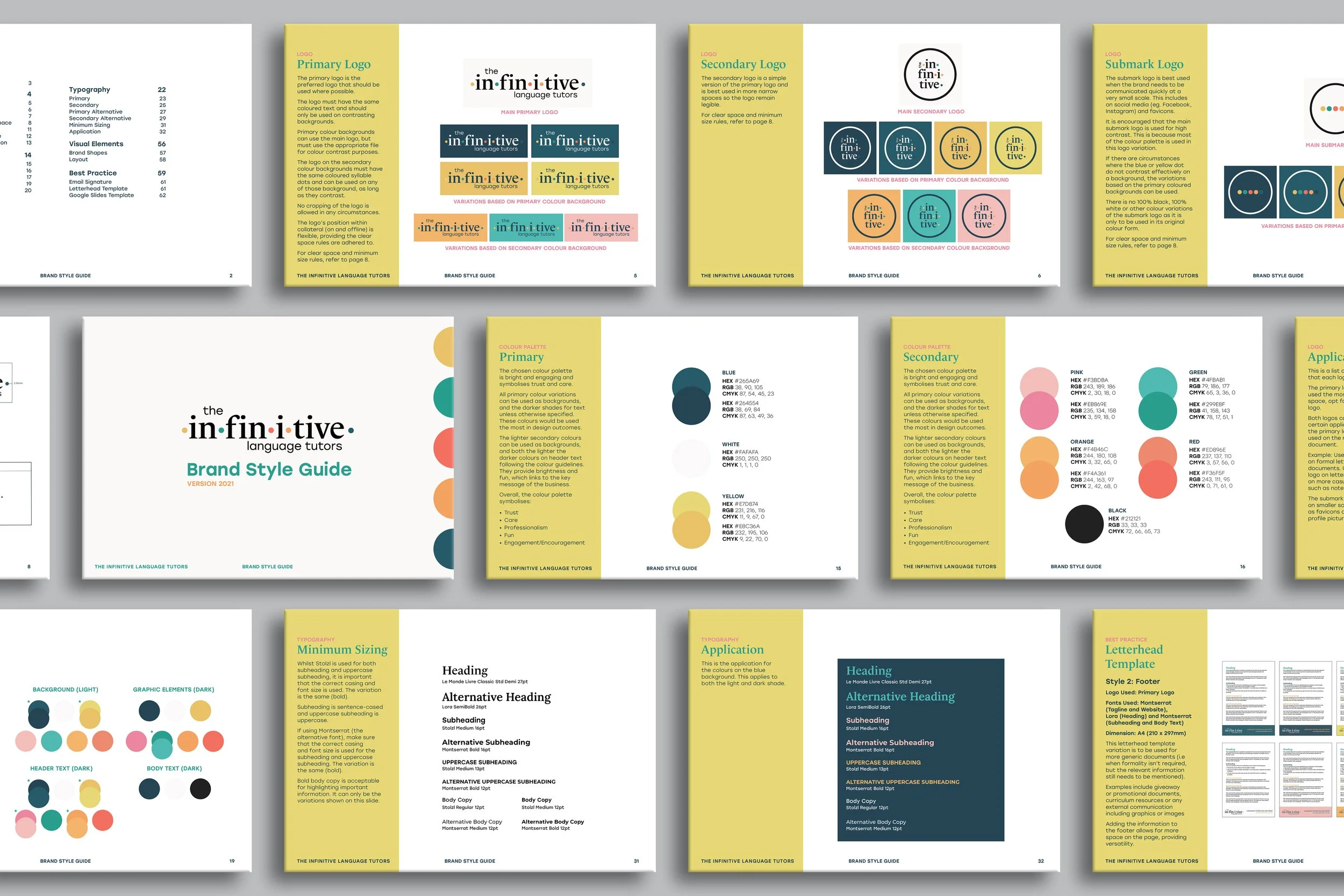
Logo Design & Brand Style Guide
A clean serif typeface was selected for the logo along with a modern sans-serif font for contrast and legibility. They also support the expression of trust and professionalism, aligning with the business’ core values.
Coloured dots were added to represent syllables and tie in with the theme of language without being too literal. It also adds a fun element along with a pop of colour without being too overpowering.
A comprehensive Brand Style Guide was created alongside the brand identity to ensure cohesiveness and consistency across all platforms that represent the brand.
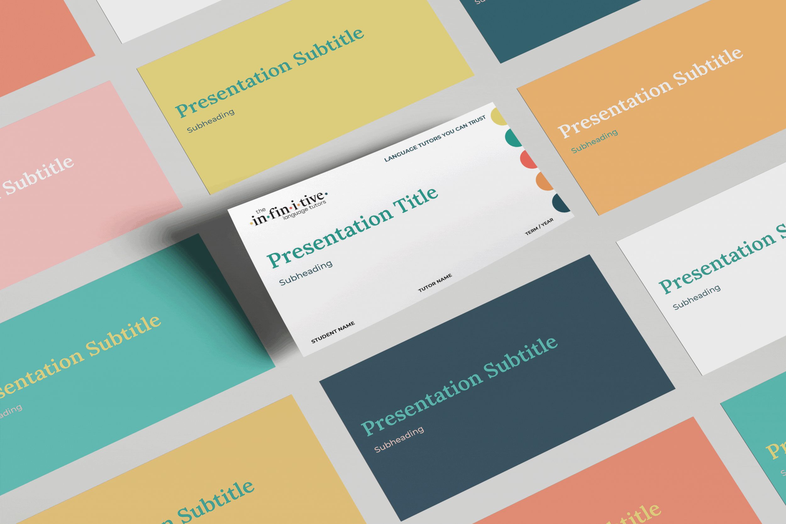
PowerPoint/Google Slides Presentation Templates
PowerPoint/Google Slides presentation templates were created to support the streamlined workflow of the business and to provide staff with a document to include content into when tutoring their students. Two different styles were created for the following purposes:
Style 1: Solid Background Colour
The Solid Background Colour slides include headings and subheadings in the appropriate colours, body text space and also a variation to include images if necessary. This style was created for professional document presentations, whether it’s during a staff meeting or a conference.
Style 2: Coloured Circle
The Coloured Circle style is set up the same as the first style, but rather than having background colours, there are coloured circles in the top-right corner that are associated with a particular topic. This style also provides ease of categorisation where required and strongly supports student learning with the prevention of distraction due to the clean layout.
Blue = Listening Yellow = Speaking
Green = Reading Orange = Writing
Red = Grammar Pink = Translation
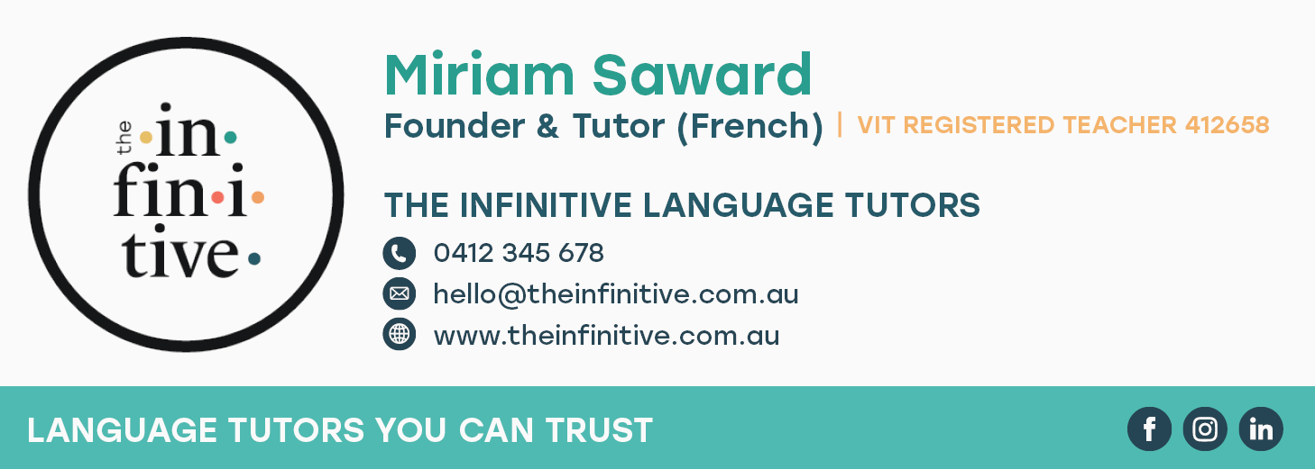
Email Signatures
Two email signature variations were created so staff had the option to include a portrait image. The options allow for personalisation to the email.
Details include:
Name
Title
Registration number (if applicable)
Contact details
Website
Call-to-action (if applicable).

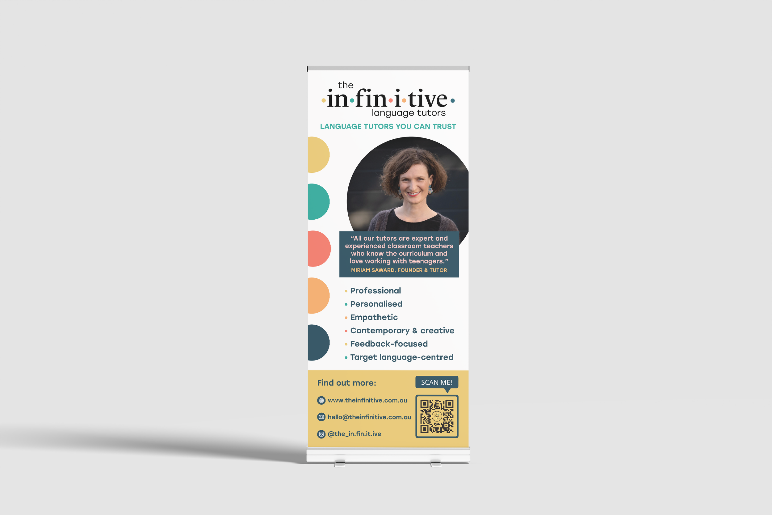
Pull-Up Banner
The Pull-Up Banner was created and printed to display at events like conferences and exhibitions for additional promotion of the business.
The design was kept clean with a strategic use of hierarchy to guide individuals through the presented information. The dot-points keep it concise and to-the-point, with the option to find out more through the contact details.
Adding the QR code as a call-to-action engages individuals to visit the website with ease.
Letterhead Style 1 – Formal
The Formal letterhead variation was designed for professional use in official communications such as invoices, letters, and certificates.
The inclusion of the Infinitive Dots adds a touch of colour and reinforces brand recognition while maintaining a clean and structured layout.
Letterhead Style 2 – Footer
The Footer letterhead variation is intended for general documents where a less formal tone is appropriate, such as promotional materials, curriculum resources or external communications containing graphics or images.
All required information is included in the footer, allowing for greater flexibility and space on the page.
The multiple colour options also supports easy categorisation of documents where required.
All letterhead styles were delivered to the client in a print and digital format.

Letterhead Style 3 – Notepad
The Notepad letterhead variation was designed for everyday use by students and tutors, providing space for handwritten or typed notes.
The Infinitive Dots appear subtly in the footer, adding brand presence and colour while keeping the design practical and unobtrusive.
“It has been a great pleasure to work with Samantha on building a visual brand for my business. Samantha showed a deep understanding of my (new) business, and was quickly able to build this understanding from the ground up into a visual suite that is really cohesive with my business's values. Samantha's work is of impressive quality; she knows how to capture a sentiment visually and how to create work that is edgy, tasteful, and professional all at once. She is a good listener, a kind and empathetic person who is a pleasure to do business with, and she is an excellent communicator with a particular gift for writing lovely, clear copy! I will miss receiving her weekly emails now that our work together is done!”
— Miriam
Founder & Tutor, The Infinitive Language Tutors